Chapter 3 Descriptive Statistics and Data Visualization
3.1 Review the Calculator Guide
Be sure to check out the calculator guide for your calculator. Knowing these calculator operations will save you time and minimize calculation errors throughout the rest of the course.
Review the sections about retaining accuracy on your calculator, using MathPrint, and using the list editor.
3.2 Frequency
When you take a sample (or even take a population census), you may have some measurements that are exactly the same. Frequency is the number of times you observed a particular value.
Example: I give a group a measure of state anxiety. The measure is scored on a scale from 0 to 100. I notice that 5 people scored 80, and 2 people scored 78. The score 80 has a frequency of 5, and the score 78 has a frequency of 2.
3.3 Frequency Distributions
The frequencies of every score form a frequency distribution. The frequency distribution tells you how many observations you have of each score.
3.4 Frequency Table – By Hand
Let’s list the frequencies for our state anxiety measure in a frequency table:
| Value | Frequency | Percent |
|---|---|---|
| 78 | 2 | 33.3 |
| 79 | 1 | 16.7 |
| 8 | 2 | 33.3 |
| 81 | 1 | 16.7 |
| Total | 6 | 100.0 |
The scores for the measure are listed as separate rows. In one column, the frequency of each score is listed. This table also shows relative frequencies, which are the percentage (or proportion) of the frequencies that are due to that score. In the table above, 16.7% of the anxiety scores were 81. Percentages and proportions express the same information. The real difference is that percentages range from 0-100, while proportions range from 0-1. If half of your participants responded, “yes” to a question, we could say that 50% of the people responded yes. We could also say that the proportion of people who responded yes was 0.50.
3.5 Frequency Table - SPSS
For all SPSS activities, it is assumed that you are able to follow the procedures listed in the SPSS Basics handout.
Open your dataset or set up a new data file.
Go to the “Analyze” menu, then “Descriptive Statistics” then “Frequencies.”
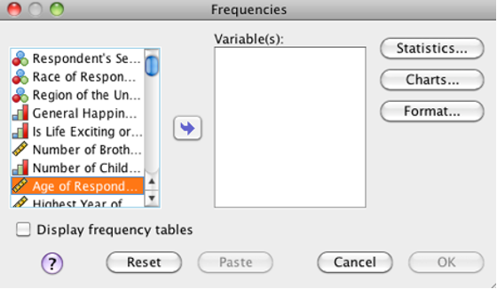
SPSS Frequencies Dialog box
Click the variable(s) you want to analyze. For this procedure, including multiple variables is exactly the same as running it multiple times using a different variable each time.
Click the right arrow to move those variable(s) into the “Variable(s):” list.
Check “Display frequency tables” (shown unchecked) on this screen to add the frequency table to your output.
Click “OK” to run the analysis now. You will see a frequency table for each included variable.
3.6 Histograms: By Hand
You can plot the frequencies on the y-axis and the scores along the x-axis to create a graph called a histogram. For our state anxiety measure, “78” would be listed on the x-axis and have a bar height of 2. “79” would be listed next to it and have a bar height of 1.
3.7 Histograms for Continuous Variables, Bar Graphs for Discrete Variables
Here is our first opportunity to apply the measurement categories we learned last class. Histograms can only be created for continuous data of ordinal level measurement or higher. Why? Because the first step in constructing the histogram is to put the frequencies in order. If your possible scores are “Yes” and “No” (discrete, qualitative, nominal data), then you cannot create a histogram. Which would be listed first, ‘yes’ or ‘no?’
For discrete variables, you can construct a similar graph, but you should include an equal space in between each bar. This emphasizes the discrete nature of the data. When you construct a histogram for continuous data, make sure the bars touch. This emphasizes the continuous nature of the data.
What if you do not meet the requirement for ordinal level data? You can construct a different kind of graph called a bar graph or a Pareto chart. It is the same as a histogram, except the bars are ordered from tallest to smallest, and there should be an equal interval between each bar.
3.8 Histograms: Using SPSS
Same procedure as the frequency table, but before running, click “Charts” then “Histograms.” “With normal curve” option will show where the frequencies would be if this data were normally distributed. You can see how closely the distribution approximates a normal distribution. Remember, the curve is not the actual data; it is where the data would have been if the distribution was perfectly normal.
3.9 Frequency Polygon
You can draw a line connecting the midpoint of each bar in a histogram. This type of graph is called a frequency polygon. It serves the same purpose–you can now visually see how your data is distributed. It is very important that all your bars are the same width!
Frequency polygons are a useful representation as your data set grows in size. It can be easier to see the shape of a frequency polygon than to inspect a grouped histogram. Frequency polygons will also used when we talk about theoretical distributions. One such distribution is the normal distribution.
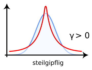
3.10 Skewness & Kurtosis: From a Histogram
A normal distribution can be identified from its histogram. A normal distribution looks like this:
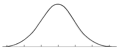
Normal distribution
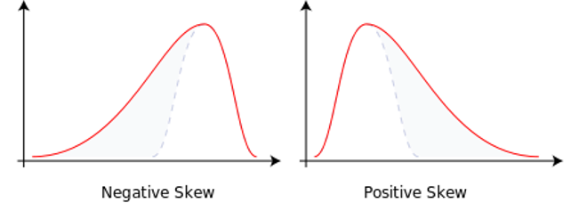
Skewed distributions are non-normal because they have a tail. The tail tells you if the graph is positively or negatively skewed. We will talk about the meaning of this later on; for now, just recognize the shape from the histogram and identify positive or negative skew.
This method is easy to check, but it is subject to interpretation.
Skewness: Look at the histogram; remember this is one of 3 ways to determine skew. If the graph has a noticeable tail at either the negative end (negative skew) or positive end (positive skew), then the distribution is skewed and not normal.
.svg)
Skewness is deviation from normality based on the shape of the histogram. Another way the histogram can differ from a normal distribution is by being to tall or too flat. This property is called kurtosis. Leptokurtic distributions (positive kurtosis) are too tall. Platykurtic distributions are too flat (“platypus” as a mnemonic is helpful to remember that platykurtic is the flat one like a platypus bill). Mesokurtic distributions are just right.
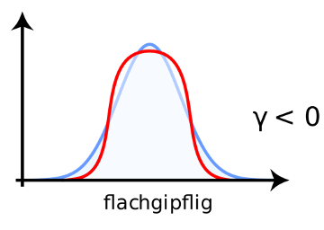
 Images from https://de.wikipedia.org/wiki/Wölbung_(Statistik)
Once you have mastered the concepts of skewness and kurtosis, you may wonder about their impact on your analyses. For all the attention we give normality, deviations from normality often do not have much impact on your statistical decision. The larger the sample size, the less the impact of skewness and kurtosis. If your sample size is small, however, then normality is more of a concern. Skewness can be problematic because of the mean’s sensitivity to outliers (discussed in the next section). Leptokurtosis can lead to an underestimate of the variance (and platykurtosis to an overestimate of variance since there are too many scores in the tails and not enough in the center of the distribution). The normal distribution will become important when we discuss the central limit theorem (CLT).
3.11 Measures of Central Tendency
Measures of central tendency are averages. There are multiple ways of expressing an average. Mean, median, and mode are different kinds of averages. Thus, there are multiple measures of central tendency. Central tendency is an attempt to summarize a data set in one number. In other words, you are summarizing where most of the data sits along the x-axis of a histogram. The goal of measures of central tendency is to describe the data set by finding middle or most typical value in a distribution (an organized set of data). We will cover mean, median, and mode and determine how to find them in a histogram as well as how to calculate their values from the raw data.
3.12 Mode
The mode is the value with the highest frequency. In other words, it’s the most commonly observed score.
From a Histogram: You can read it in the histogram by seeing which bar is the highest. Note that if the histogram is grouped, your mode is really a range of modes, because each bar represents a range of scores.
From Raw Data: You can calculate it by counting the frequency for each score (i.e., generating a frequency table) and seeing which score has the highest frequency.
Bimodal & Multimodal: If the histogram has two peaks it is bimodal (i.e., it has two modes). If the histogram has three or more peaks it is multimodal (i.e., it has three or more modes). Remember that if a distribution (a.k.a. organized set of data) is bimodal or multimodal, it is not normally distributed. Multimodal distributions often occur when there are multiple effects behind the variable. For example, a distribution of shoe size would have two modes due to differences in shoe size, on average, between men and women.
Level of Measurement: To calculate the mode, you can use any level of measurement. That means nominal data or higher. To calculate a mode, all you have to compute is frequency.
3.13 Mean
The mean is the most commonly used average.
In APA format, the mean is expressed with an italicized M (M = 3.5). We will use the Greek symbols for the mean found across disciplines: \(\bar{X}\) (commonly called “x-bar”) for the sample mean and \(\mu\) (“mu” which is pronounced like “mew”) for the population mean.
From Raw Data: Add all the scores and then divide by the total number of observations.
From a Histogram: the mean is the balancing point on the histogram. Imagine each bar in the histogram is made of equivalent blocks. The mean is the point along the x (horizontal) axis where the blocks would balance.
If you think about the physics of a lever, the further away from the center, the more a single block would tip the scale. In the same way, the mean is very sensitive to the presence of an outlier (an extreme score). Remember that outliers are one cause of skew.
If you only have a histogram and no raw data, you can use this computational method to estimate the mean:
- Multiply the midpoint of each bin by the frequency for that bin. If 50 people scored 90 points on the exam, you would multiply 90 points (the midpoint of the bin) by 50 (the frequency of the bin) to get 4500.
- Sum all the numbers calculated in step 1.
- Divide the sum by the total number of scores.
Level of Measurement: To calculate a mean, you need ratio data or higher. This is because the differences between the numbers are assumed to have meaning.
Note some mathematical properties of the mean:
- Adding or subtracting each score by a constant changes the mean by that amount.
- Multiplying or dividing each score by a constant changes the mean in the same way. For example, if you multiply every score in the distribution by 2, you will double the mean.
- The sum of deviations around the mean will always equal zero. What’s a deviation around the mean? Take one score in the distribution and subtract the mean. The result is that score’s deviation from the mean. If you do this for every score and sum all deviations, the result will be zero.
3.14 Median
The median is the middle value when the observations are ordered from least to most. Half of the observations scored below the median and the other half of the observations scored above the median. Another term for the median is the 50% percentile because half of the distribution has equal or smaller values. Percentile is the percent of scores in a distribution at or below a particular score.
In APA format, the median is expressed with an italicized Mdn (Mdn = 3.5).
From a Histogram: The histogram is not set up for finding the median easily. It’s easier to use the raw data. If you shade the area under the histogram, you’ll find that 50% of the shaded area is to the left of the median.
From Raw Data: Rank each observation from lowest to highest and then counting from both sides. For an even number of observations, the middle score will be between two numbers. Find the mean of the numbers to the left and right of the middle (add them and divide by 2).
Level of Measurement: To calculate the median, you need ordinal data or higher.
3.15 Outliers
As discussed previously and in the lecture, an outlier is an extreme score. Outliers can be problematic when you want to summarize a sample using an average. They will come up again when we talk about correlation. For now, recognize that there are multiple reasons for an outlier in your data set.
Practically speaking, “outliers” are most commonly caused by incorrect data entry. Add an extra zero, and one person has an extreme score. If you do not inspect your data, you may not notice this and wonder why the mean is so high or low. In other cases, the outlier is not really a member of the population of interest (i.e., you are conducting a study of college students and one of your participants is a professor) and you can exclude them from your sample. It is also possible that the outlier is a member of your population of interest but their score is simply rare (rare doesn’t mean impossible). In that case, you, the researcher, must decide whether to leave the outlier in (most conservative), exclude the outlier, or reduce the score of the outlier so that it does not have as much impact (least conservative).
Outliers also cause skewness. Some statistics we will cover expect a normal distribution. Outliers can disrupt our plans because they make distributions non-normal. An outlier on the positive end of the distribution will lead to positive skew. An outlier on the negative end of the distribution will lead to negative skew. The outlier is the cause of the “tail.”
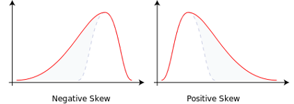
Two distributions, one with negative skew and one with positive skew
3.16 Finding Outliers in SPSS
Go to the “Analyze” menu, then select “Descriptive Statistics,” and then select “Descriptives.” Note that we usually use the “Frequencies” command for other descriptive stats.
Move the variable of interest over to the right.
Check the “Save standardized values as variables” checkbox. Click “OK.”
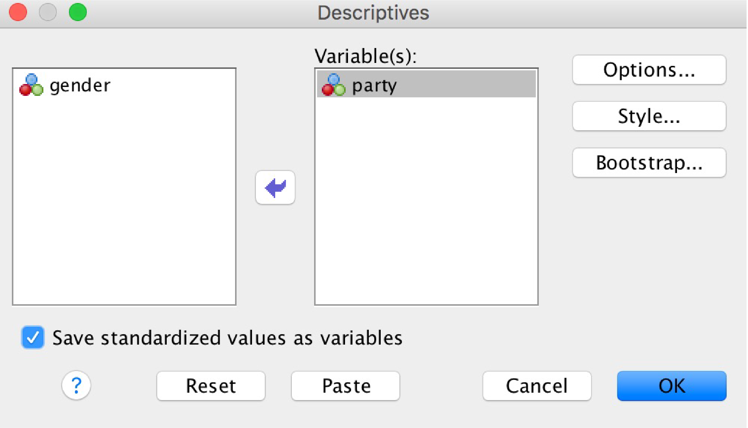
The SPSS Descriptives box
Ignore the output window. Back in your data, you’ll find one new variable has been created (in the example shown, it was called “Zparty”). These new scores are z-scores. Outliers are any scores with a z-score greater than 3 or less than -3.
3.17 Which Measures of Central Tendency Are Appropriate?
Remember that only in interval and ratio scales do the distances between values carry meaning. You can only add and subtract interval and ratio scales, and you can only multiple and divide with ratio scales. Therefore, strictly speaking, you cannot calculate the mean of anything but a ratio scale. “When we compute the mean of the numerals assigned to a team of football players, are we trying to say something about the players, or only about the numerals? The only”meaningful" statistic here would be N, the number of players assigned a numeral.” (Stevens, 1957, p. 29). But there has also been some debate on this (Lord, 1953). The best recommendation is to critically evaluate whether a particular measure of central tendency has meaning while considering its underlying level of measurement.
3.18 Skewness – From Measures of Central Tendency
This method lets you assess skewness without SPSS or a histogram and gives you a quick answer. Real data rarely has exactly equal means and medians, so this method is a little too precise. - No skew: If the mean and median are equal - Negative skew: If the mean is less than the median - Positive skew: If the mean is greater than the median
3.19 Skewness & Kurtosis – From SPSS
Using SPSS is another way to calculate skewness. SPSS tells you whether small amounts of skewness are significant or attributable to chance.
Same procedure as Frequency table, but before running, click “Statistics” then “Skewness and Kurtosis.” Before clicking “Continue” and “OK.”
In the output, positive values of skewness mean positive skew. Positive values of kurtosis mean leptokurtic data (negative kurtosis is platykurtic).
Divide “Skewness” value by “Std. Error of Skewness.” Separately, divide “Kurtosis” by “Std. Error of Kurtosis.”
What you want to see: Each should be between -2 and 2. This means there is no significant skewness or kurtosis. In the example below, our skewness calculation for VAR00002 is 3.32 (since it’s greater than 2 and positive, this data is positively skewed) and the kurtosis calculation is 1.84 (not significantly kurtotic although it is in a positive direction).
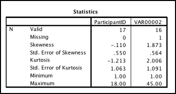
SPSS Statistics Table output showing values of skewness, kurtosis, standard error of skew, and standard error of kurtosis
3.20 Population Parameters versus Sample Statistics
Remember that we previously distinguished between populations and samples. When you are summarizing data collected from your entire population, then you should use formulas for population parameters. When you used sampling to collect your data (that is, it does not include all members of the population), you should use sample statistics. Any time the dataset represents a subset of the population, sample statistics should be used.
SPSS always computes sample statistics.
For central tendency, the calculations were the same for samples and populations. When calculating an index of variability, you have to select the proper formula. Samples tend to have smaller variance than their underlying populations. Because the purpose of a sample is to represent its population, the sample statistics are corrected to adjust for this tendency. This adjustment is called Bessel’s correction. This correction is an approximation; it is not a perfect correction for sample statistics.
3.21 Range
Range is the difference between the highest and lowest number. If the lowest I.Q. score you measured was 80 and the highest I.Q. score you measured was 110, then the range is 30 IQ points. Higher range means that the data is more spread out; lower range means that the data is closer together.
Range is measured in the same units as the variable. So in the previous example, the range was 30 IQ points.
While range measures the width of the histogram, it is only affected by two scores: the endpoints. It also tends to fluctuate with the group size.
3.22 Interquartile Range
Closely related to range is the interquartile range (IQR). It is the difference between the upper (Q3) and lower (Q1) quartiles. How do you get the quartiles? Q2 is the median. Q1 is the “median” of all the data below the real median. Q3 is the “median” of all the data above the real median. Some methods include the median when computing the quartiles, but most calculators do not. There is no one right method, unfortunately. Q3 – Q1 = interquartile range.
3.23 Box Plots
Box plots are a handy way to show the quartiles, IQR, and range. In a box plot, these values are drawn to scale:
- Minimum value
- Q1
- Q2 (the median)
- Q3
- Maximum value
Be sure to also include a scale along the bottom.
3.24 Sum of Squares
Sum of squares is the sum of all squared deviations from the mean. The idea is to find the total deviations from the mean. If we just added all deviations from the mean, we would always get zero—the sum of all deviations from the mean always equals zero (it’s the balance point, after all). Squaring each deviation (distance from the mean) solves this problem.
Formula: Sum of squares for a sample = \(\sum{X^2} - \frac{\sum{X}^2}{n}\)
Formula: Sum of squares for a population = \(\sum{X^2} - \frac{\sum{X}^2}{N}\)
Note that the formula for the population is the same as the formula for the sample.
Notation note: the number of scores in a sample is n. The number of scores in a population is N.
3.25 Variance
Don’t confuse the words variability and variance (many people do). Variability is the concept; it is a tendency for the numbers to be different and spread out. Variance is a calculation that describes how much variability exists in a distribution. Variability is the construct, and variance is the measure.
“Mean square” is another name for variance. You’ll hear “mean square” often when we discuss the ANOVA procedure. For now, recognize it as a synonym of variance.
The larger the variance, the more spread apart the numbers are, on average.
Variance has “units squared” as the unit of measurement. Replace “units” with the name of the variable. Variance of height data is expressed as “height squared.”
Variance for a sample: \({s^2} = \frac{\mbox{sum of squares}}{n-1}\)
Variance for a population: \({\sigma^2} = \frac{\mbox{sum of squares}}{N}\)
In words:
- Find the Sum of Squares (SS).
- If it’s a sample: Subtract 1 from the total number of observations. This result is n - 1. If it’s a population: Just take N
- Divide Sum of Squares by your calculation from step 2.
Why two formulas for variance? A property of random samples is that they tend to underestimate the variance of the underlying population. When finding sample variance, 1 is subtracted from N in order to increase the estimated variance. The adjustment is called Bessel’s correction.
3.26 Standard Deviation (SD)
Standard deviation is the square root of variance. The square root of something is the number that you would multiply by itself to get the original number. The square root of 16 is 4 because 44 = 16. The square root of 9 is 3 because 33 = 9.
Standard deviation for a sample: \({s} = \sqrt{\frac{\mbox{sum of squares}}{n-1}}\) or \(s = \sqrt{s^2}\)
Standard deviation for a population: \({s} = \sqrt{\frac{\mbox{sum of squares}}{N}}\) or \(\sigma = \sqrt{\sigma^2}\)
In words: - Find the variance for either a sample or population, as appropriate - Take the square root of the variance.
3.27 Standard Deviation is More Useful than Variance or Sum of Squares
The standard deviation is a more useful measurement than variance for a number of reasons:
3.27.1 Unlike variance, SD is expressed in the same units as the variable
This means that if you find the standard deviation for a set of IQ scores to be 3.2, then the answer is 3.2 IQ points. The standard deviation for January high temperatures is given in degrees. SD is easier to interpret than variance.
3.27.2 In normally distributed data, a majority of the scores (about 68%) will be +/- 1 standard deviation from the mean.
We’re discussing what is also called the “Empirical rule” or the “68–95–99.7 rule.” This is a property of standard deviation when data are normally distributed. Let’s take scores from this population: 0 1 2 3 4 5 5 6 7 8 9 10. The mean, median, and mode are 5, so it satisfies our tests for normality. The variance is 9.17, so the standard deviation is 3.08.
Most of the scores will fall within the range of M - SD to M + SD.
3.08 below the mean is 5 – 3.08 = 1.92, 3.08 above the mean is 5 + 3.08 = 8.16. Thus, most of the scores fall between 1.92 and 8.16 (do they?).
3.27.3 In normally distributed data, most all of the scores (about 95%) will be +/- 2 standard deviations from the mean.
Extending this range to 2 standard deviations gives us a range of -1.16 to 11.16. In this case, all scores are within 2 SDs.
3.27.4 In normally distributed data, nearly all of the scores (about 99.7%) will be +/- 3 standard deviations from the mean.
Extending this range to 3 standard deviations gives us a range of -4.24 to 14.24. Since all scores were within 2 SDs, all scores are still within 3 SDs. This pattern is easier to observe with larger distributions.
3.28 When do we find normally distributed data?
Many textbooks will suggest that normally distributed data are “all around us,” implying that you should expect samples to be normally distributed, and if they are not, something is wrong. This is a little misleading. Populations are not inherently normally distributed. A single sample is not inherently normally distributed, either.
Sometimes, we find normal distributions naturally. Some effects, like shoe size, follow a normal distribution in the population. This happens when most people have one shoe size (the mean), and other people tend to have shoe sizes close to the mean. Relatively few people have shoe sizes far from the mean. Other times, we design our measures so that they end up normally distributed. Many IQ tests, for example, use 100 IQ points as an arbitrary mean, and they design the test so that most people score near 100 points.
Most of our inferential statistics make assumptions about the normality of samples and populations. Often, there will be an assumption that your underlying population is normal. However, there are ways in which the normality assumption can be satisfied even without normally distributed samples. We will discuss the specifics when we get to inferential statistics.